The Chic Modernist
No expense was spared in the transformation of the Wescott condo from a basic, 90s rental pad into a luxurious, chic downtown pied-e-terre condo. Come on over to the dark side with us as we share with you one of the chicest renovations wrapped in Detroit.
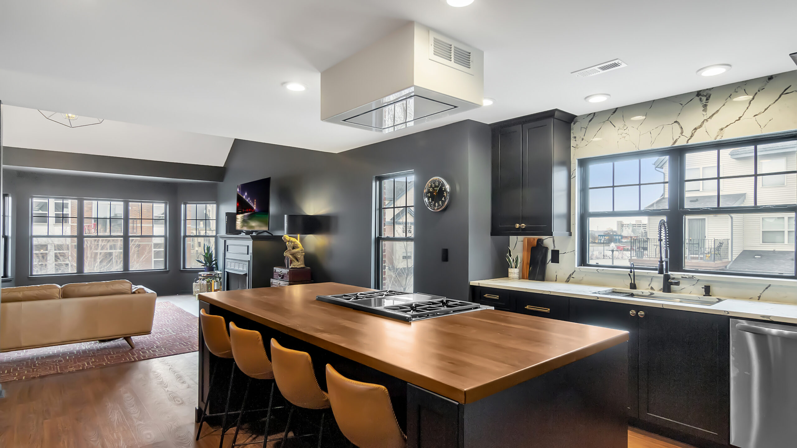
It’s often easy to shy away from black kitchens but in this case, our trendsetting clients the Wescotts knew a dark space would work perfectly in their new, up-and-coming downtown neighborhood. Location, location, location is certainly important but the 90s vibe interior with oak cabinetry, track lighting and pastel walls had to go.
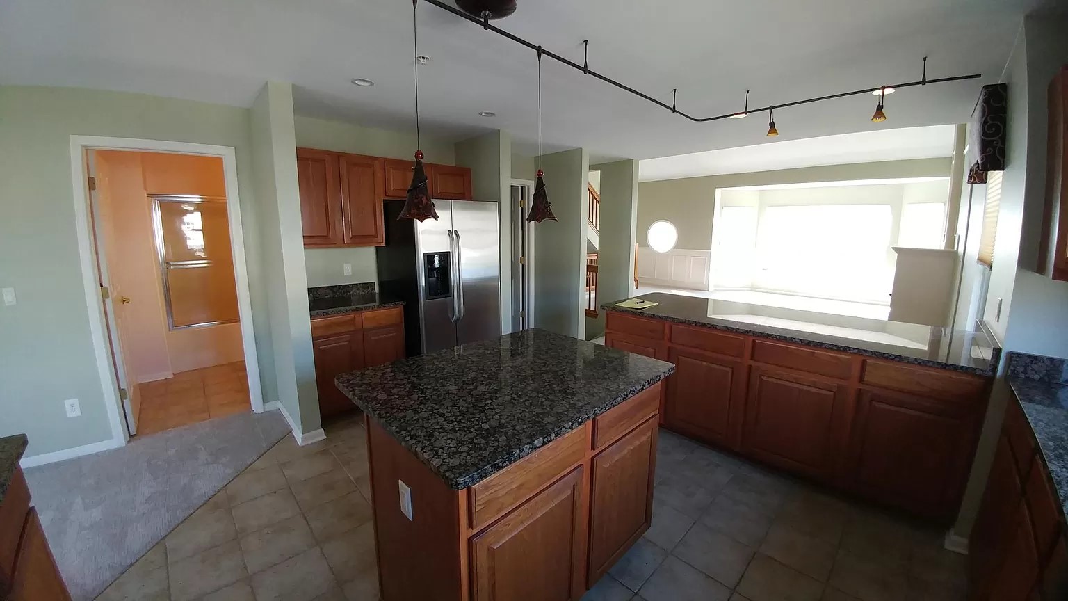
What before was a small kitchen with a tiny island and inefficient peninsula is now a space that has been opened up and expanded to include 3 key functional areas for the entertainers, who equally adore entertaining guests, cooking and a strong happy hour. With the help of trusted general contractors, Ultimate Building & Remodeling, we first began to gut the entire kitchen and built a wall for added pantry storage. The wall space also gave our entertainers a more closed off dining space for their love of dinner parties. It’s the power team of a functional layout with high design that really gets us!
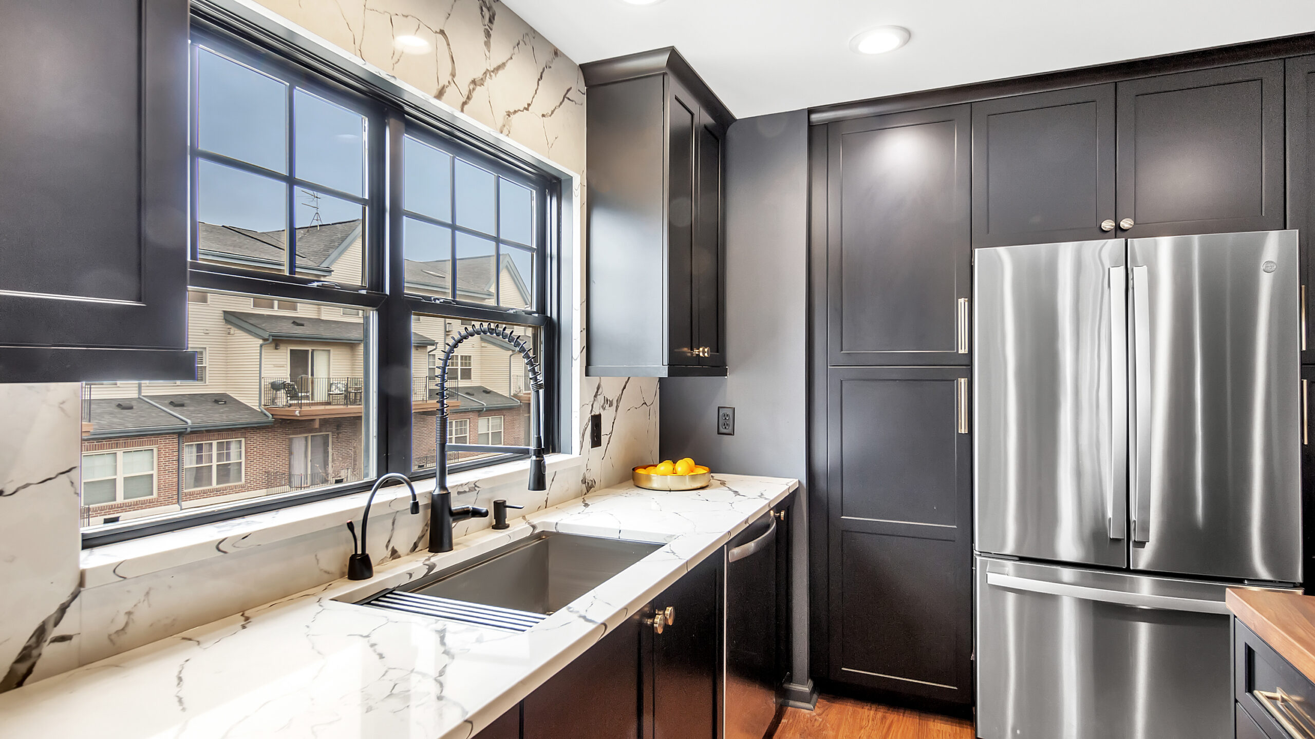
The entire kitchen features black Mouser Custom cabinetry paired with an inky, deep wall color. Together, they provide the perfect backdrop for the marble look-alike, thickly veined quartz countertops and backsplash. The showstopper of the space is certainly the oversized island, topped in a beautiful walnut countertop, which houses the commercial-grade Wolf range. Flanking the range is roll out cabinetry designed with spice storage as well as utensil storage, keeping necessary items close at hand when cooking. The addition of the luxurious walnut countertop not only adds warmth to the room but also adds a significant amount of depth. Despite the dark cabinetry and dark walls, the kitchen still feels airy with all the natural light streaming through many windows.
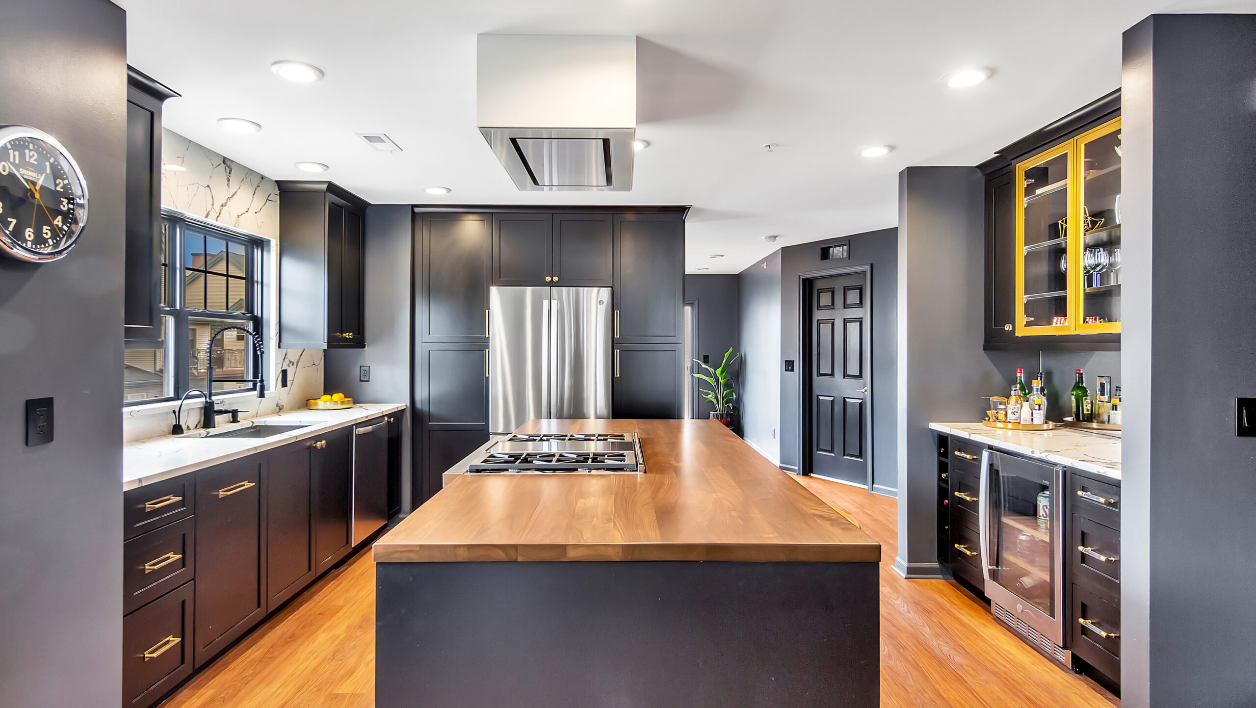
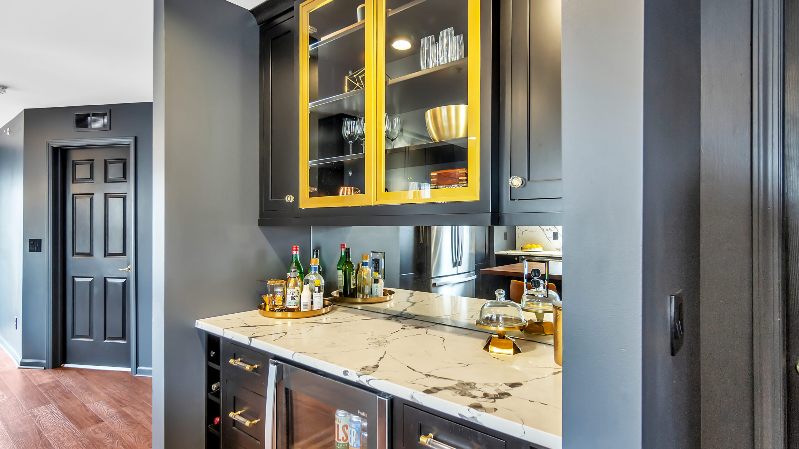
By moving the refrigerator and flanking it with tall pantry cabinetry, we were able to leave ample space to design a gorgeous inset cabinetry bar. This swanky bar was also designed in black matte cabinetry and accented with brushed gold metal doors. Ample bar storage was included by designing wine cubbies next to the wine refrigerator as well as extra cabinetry for glass and serve ware. The bar is further enhanced with a smoked mirrored backsplash and cabinet lighting. The addition of the lucite and gold hardware makes anyone feel they’re at a swanky bar whilst sipping on the house cocktail, an Old Fashioned.
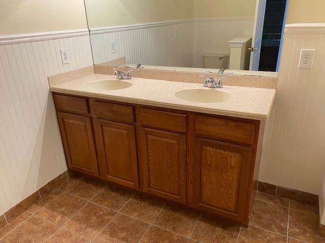
The original bathrooms in the condo didn’t stand a chance when it came to our design forward homeowners either. The before shots left little to admire with their awkward layouts, dated colors and ineffective use of space.
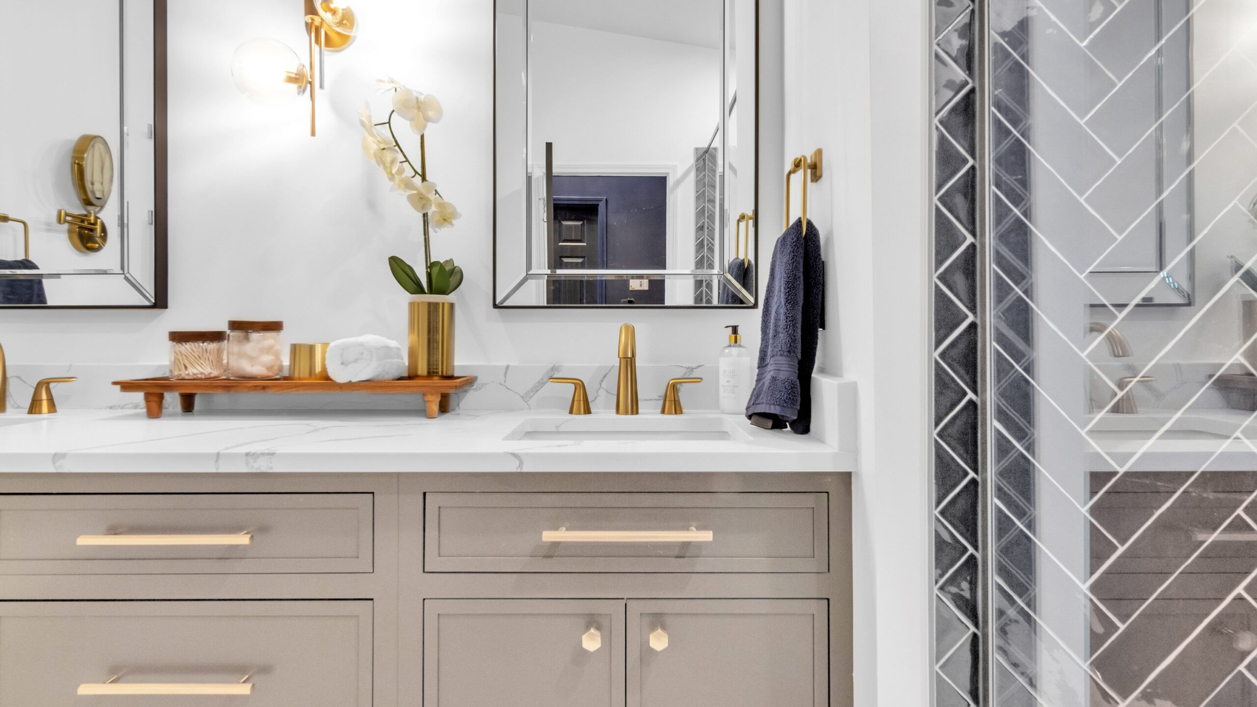
The primary bathroom takes on a completely different vibe than the rest of the home with its light, airy and elegant style. The inset Mouser cabinetry was designed in the color carbide and offers nearly double the space and function of the original bathroom. To keep the space a classic yet offer even more visual appeal, we opted for a navy-blue herringbone tile and gold dual-headed shower fixtures. There’s no doubt of the serene interest this bathroom now offers our homeowners.
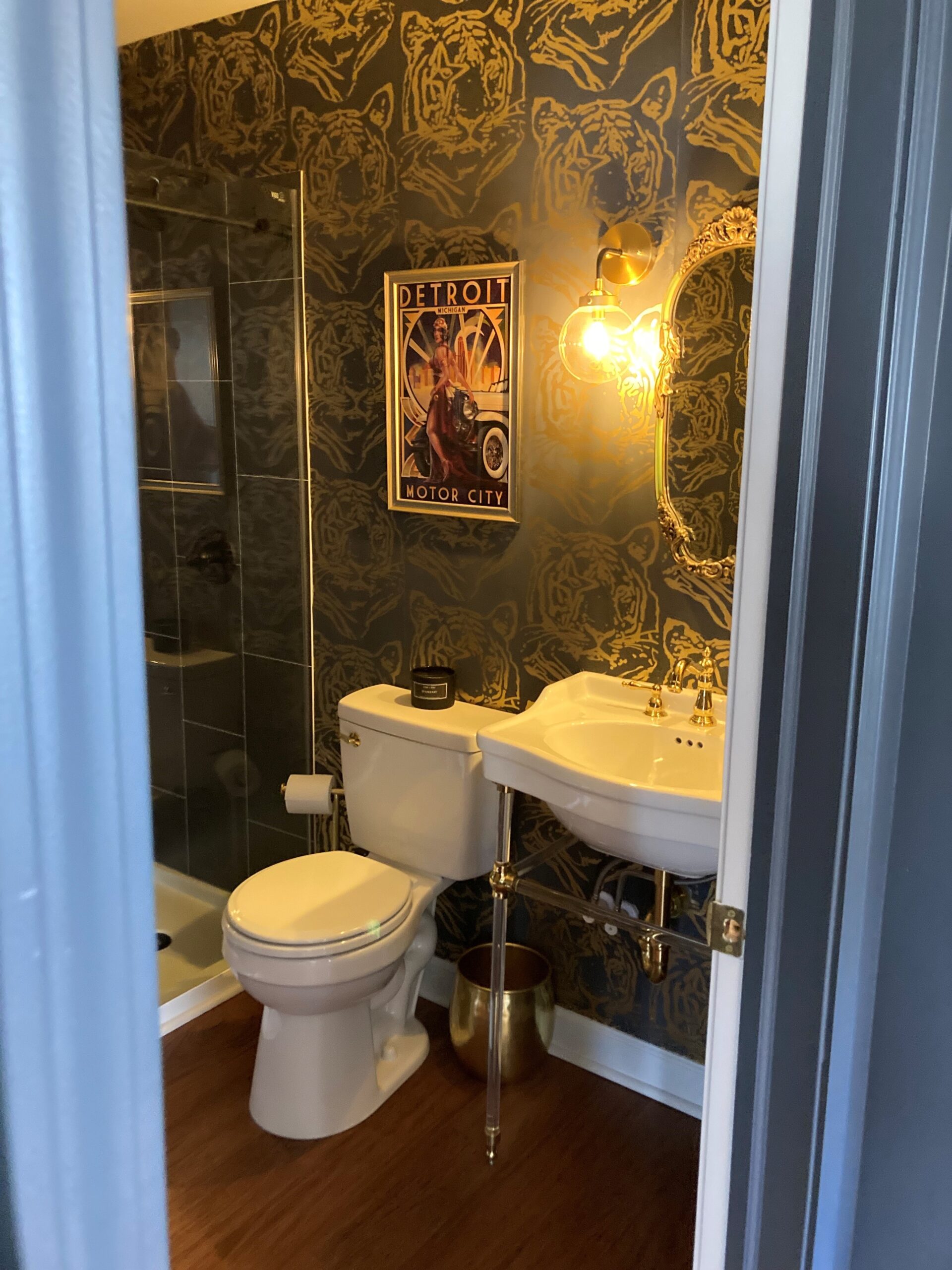
If we’re talking bathrooms, we can’t go without sharing the guest bath that was also gutted and renovated to its core. The space screams of the speakeasys of Detroit’s past with its deep gold accented statement wallpaper, vintage mirror and minimalist sconces. The highlight of the powder room is by far the lucite legged sink with polished brass faucet. It’s hard to find a bathroom with more visual appeal.
Chic and sophisticated, this renovation is quite literally the knee-high black boots of the interior design world. Grab yourself an old fashioned and let’s cheers to the Wescott’s and their edgy new space!
< Back to Posts

