Countertops for White Cabinetry
White cabinetry has been one of the most popular cabinet choices for years and the reason for that is simple – white is versatile and fits among any style of design.
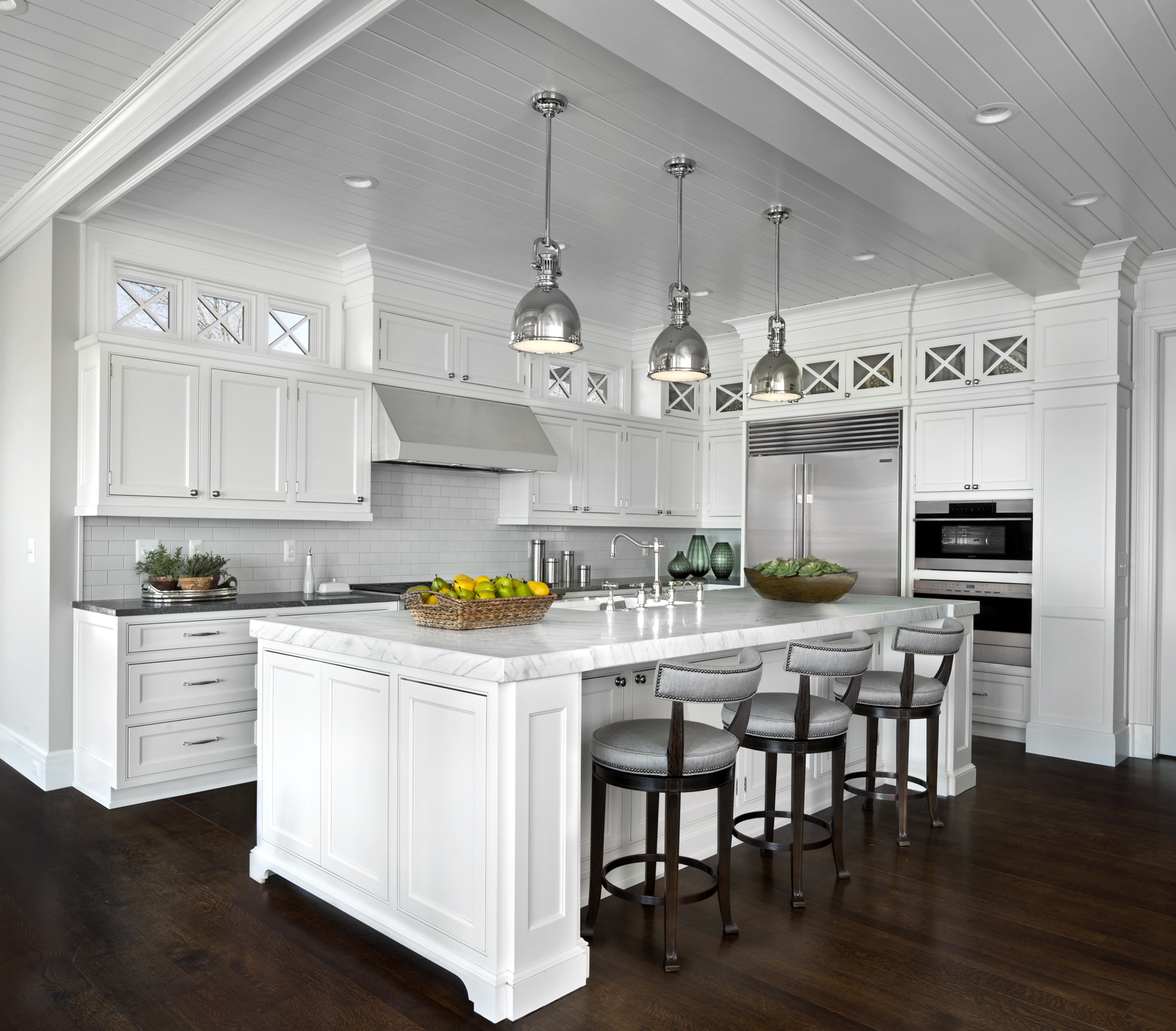
Pictured here is our take on a traditional, low contrast kitchen designed in Ayr Cabinetry with an extra thick Marble countertop.
Another perk to using white cabinetry in the kitchen is the endless options for countertops, both in material and color. Know what else comes along occasionally with endless options? Feeling overwhelmed by said endless options. To combat that feeling, our Dream Team is here to help you narrow down your choices by sharing three different looks to consider for your white cabinetry.
1. A Low Contrast Look
The look of a low-contrast kitchen is simple and clean. A low contrast kitchen showcases a white or light-colored countertop with minimal detail. To complete this look, backsplash materials should also be white or off-white and offer the most subtle of shift from the countertop and cabinetry colors. The goal of the low-contrast kitchen is to avoid a noticeable difference between the color and depth of the cabinets and the countertops and backsplash.
If you’re considering this low contrast look consider adding a few of the following design elements:
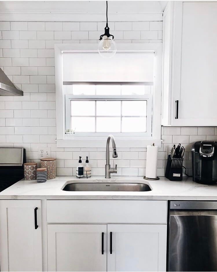
Light-toned countertop matching close in color to the cabinetry; the most popular option in 2021 would be a Cambria quartz countertop, followed by granite or quartzite. Here are a few of our favorites!:
- Ironsbridge by Cambria presents veining in both warm and cool tones, which means you can coordinate this top with any color hardware or plumbing accents.
- Brittanica by Cambria is one of Cambria’s most popular products and it’s no surprise why. This countertop offers loads of movement with ash-colored veining and charcoal specks that nearly jump off the countertop.
- Calcacatta Macubus Quartzite is a great alternate for marble but is a much harder and more durable stone. This particular variety is a great alternate for a practical version of the traditional white cabinets, white countertops kitchens.
- If granite is a better option for your needs, you can’t go wrong with Colonial White. With points of black and dark gray minerals stretching across the cool white background, this is one of the lightest shades of granite you can find to keep your low-contrast kitchen.
- For more background on the differences between countertop options, check out our blog on Pairing Kitchen Cabinets Countertops.
A fun tile backsplash (think, arabesque or geometric pattern) with a darker grout to highlight the pattern
- For the low-contrast kitchen, we suggest keeping the backsplash tile as close to the color of your cabinetry and countertop. While we suggest keeping it safe in this respect, that doesn’t mean your backsplash can’t make a statement! When it comes to backsplash tiles, no shape is off-limit. Whether it be subway tiles, textured tiles, geometric shapes or basketweave, don’t be afraid to make a statement with this component of your space. Your E.W. Dream Team designer can connect you with some of our preferred providers for tile selection.
Kitchen hardware is certainly becoming the jewelry of the kitchen and we’re here for it! Most recently, anything that shines seems to be quite popular, including golds, brass and champagne bronze. Here are a few expert recommendations to keep in mind when selecting your cabinetry hardware:
- Try to choose hardware that is consistent with the style of your kitchen. If you have square or frameless cabinetry, you’ll want to choose hardware that is more contemporary rather than one that is detailed and more traditional in style.
- Long gone are the days of matching metal finishes to every other metal in your kitchen so don’t feel stuck to stay with the same finish material. Not only is it on-trend to mix up your metals in your kitchen but it’s visually appealing! Bring on the chrome and matte black! Brass and white? You go!
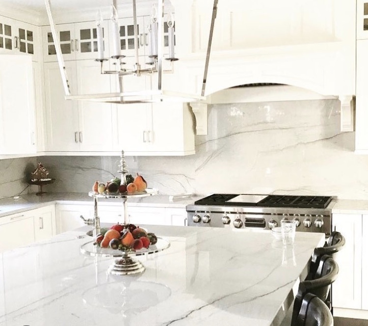
The above kitchen is super low contrast. Note here that there’s a very minimal shift between the soft gray undertones of the quartz countertop and backsplash and the warm white cabinetry.
2. A Medium Contrast Look
The look of the medium contrast kitchen is where the majority of the kitchens we design fall. The medium contrast kitchen keeps the cabinetry simple in white or off-white but also brings in 1 to 2 products to offer a contrast to said cabinetry.
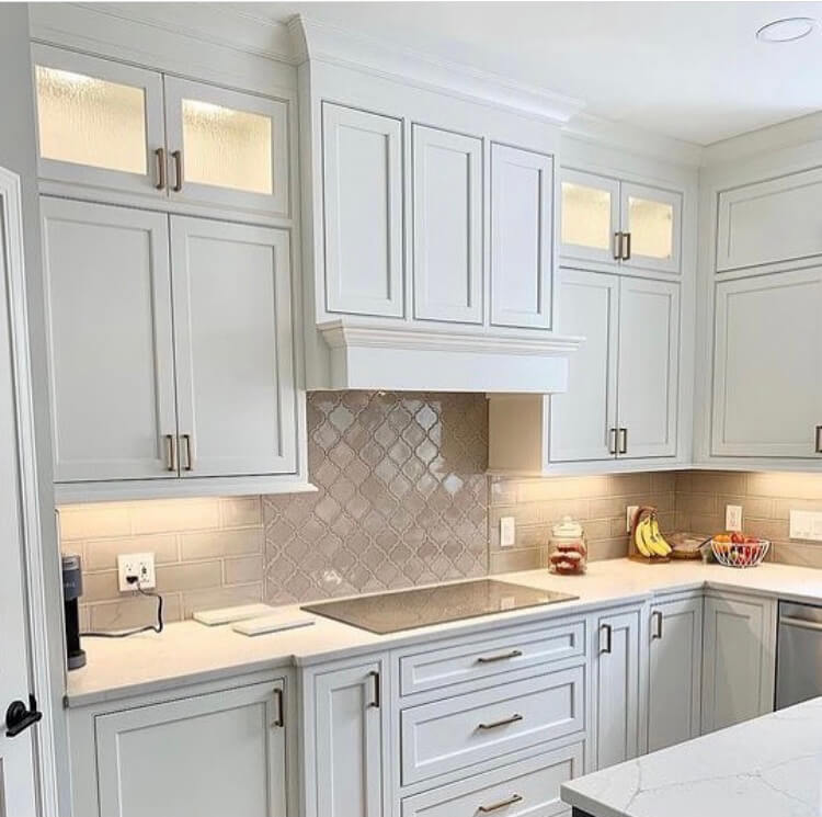
If you’re considering a medium-contrast look, consider adding a few of the following design elements:
A medium-toned countertop with more noticeable detail and or veining. Here’s what we’re seeing in design right now:
- White Attica by Cesarstone is an alluring mix of both gray and black inky tones over a flawless white base. This countertop pairs beautifully with a simple white backsplash and a darker grout.
- If your colors learn more warm than cold, we cannot recommend enough Cambria Brittanica Warm. With translucent yet subdued grey veins streaming across a white backdrop, it offers just enough contrast next to white cabinetry.
- In regards to granite, we recommend Fantasy Brown, which has cool gray waves and swirls throughout with the faintest hues of green and rose. The stone is truly unique.
In the medium-contrast kitchen, we often incorporate backsplashes can typically go one of two ways;
- First would be matching the backsplash material to the cabinets but using a darker color grout for a more noticeable and pronounced look. The second option for a backsplash would be keeping the color similar to the shade of the cabinetry, but adding in a backsplash tile with texture, veining or movement.
- If you find yourself struggling to find an appropriate backsplash or prefer a more streamlined look, you can always carry your countertop up your backsplash. The trend became very popular in 2020 and adds an incredible amount of drama to a kitchen.
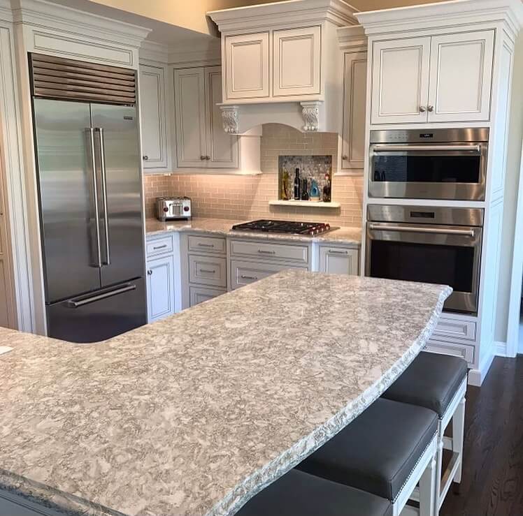
When it comes to selecting hardware for your medium-contrast kitchen, it’s perfectly acceptable to go bold to try and offer balance to your medium-toned countertops.
- We’re having a love affair with black hardware, the chunkier, the better.
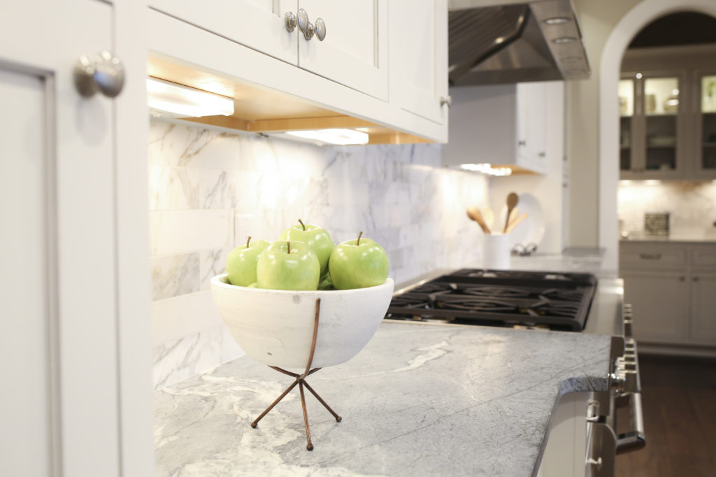
The medium contrast kitchens above showcases how you can create a striking look between countertop and cabinetry without having to go too dark and bold. In the last photo, the dark gray soapstone countertop juxtaposed against the gray and white marble backsplash offers depth and visual interest to the space while complementing the beautiful cabinetry.
3. A High Contrast Look
The high contrast white kitchen provides the most pop of the three different color palettes. In this styled space, there are typically two products that blend together with one pop of color, typically in the countertop. We see a lot of these spaces with white cabinetry, white backsplashes, and a dark jolt of countertop in a deep gray or black color.
If you’re considering a high contrast white kitchen we do recommend incorporating some ways to tone down the look by:
Keeping materials simple. This includes both countertops (minimal veining in quartz or a simple granite) and backsplashes.
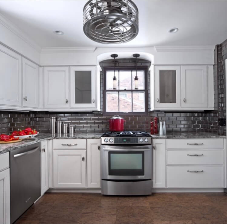
- Caeserstone Vanilla Noir offers a classic black base with light incredibly subtle light veins. For a more bold quartz option, you can’t make a larger statement than Cambria Blackbrook. With white-lightening striking against a smooth black background, it brings an elegantly modern chicness to any space.
- If a natural stone better aligns with your style, we recommend considering a natural quartzite. For the perfect high-contrast look against your white cabinetry, we would suggest Bellevedere Quartzite, which boasts a jet-black background beautifully contrasted with dramatic gold veins.
When it comes to backsplashes, don’t be afraid to go big! Do you crave patterns? Have a favorite color? Don’t be afraid to pair color and style into your high-contrast style.
With a high-contrast kitchen, it’s important to keep hardware minimal. Whether that be with simple cabinet doors unadorned with details or very simple and clean hardware.
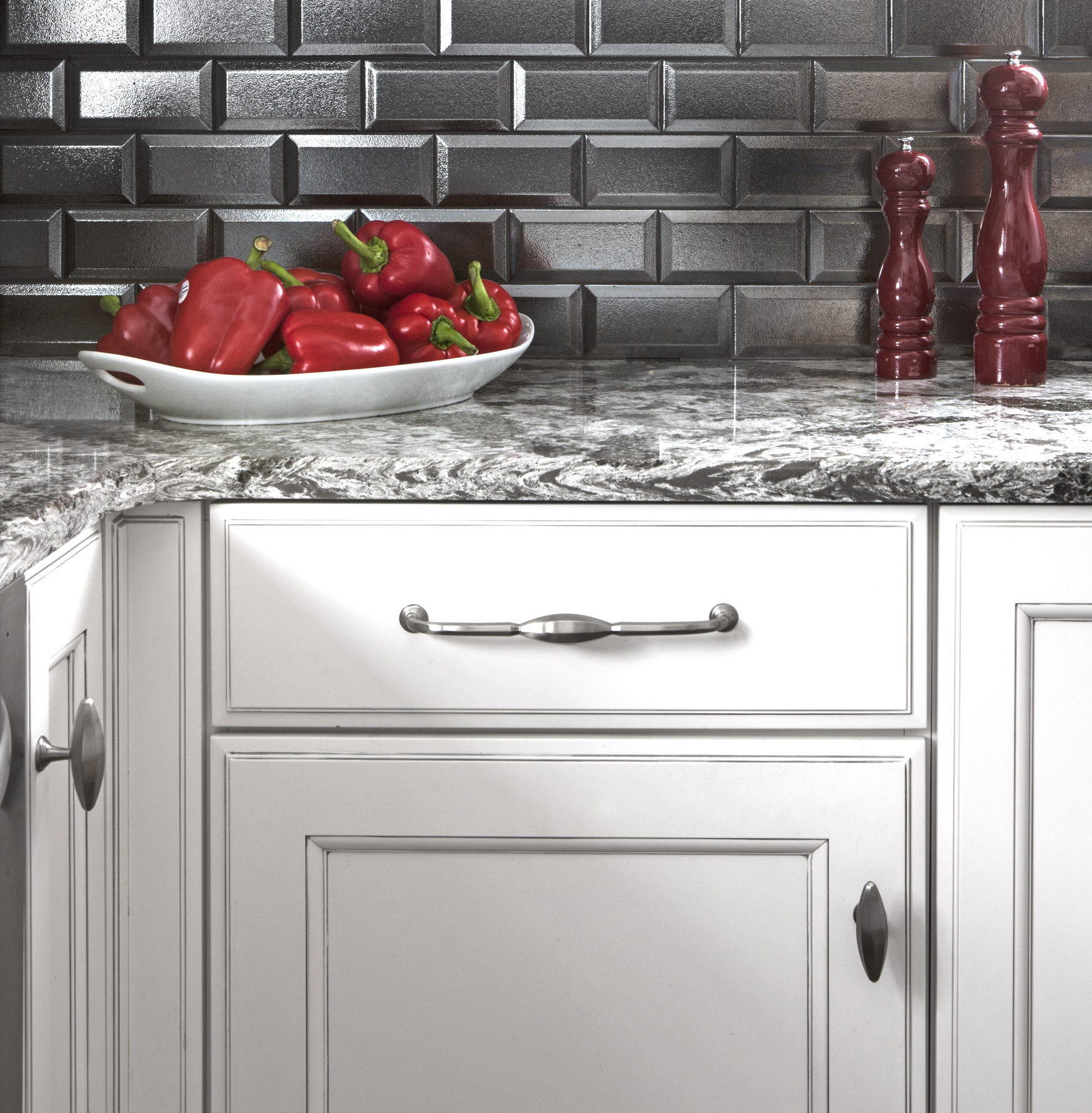
The white cabinets in this high-contrast kitchen are in striking contrast to the deep gray granite countertops and metallic gray subway tile backsplash.
We get it, there are a LOT of countertop colors to choose from. Luckily for you, your choice of white cabinetry means you really can’t go wrong with what you select. If you’d like more help in finding the color that’s right for your kitchen, trust our kitchen and bath experts to know their stuff.
< Back to Posts
